Case study
Jun 17th 2026
DASH Team
At DASH, we don’t sell extra design. We save time and budget
Sometimes a full redesign isn’t the right solution.
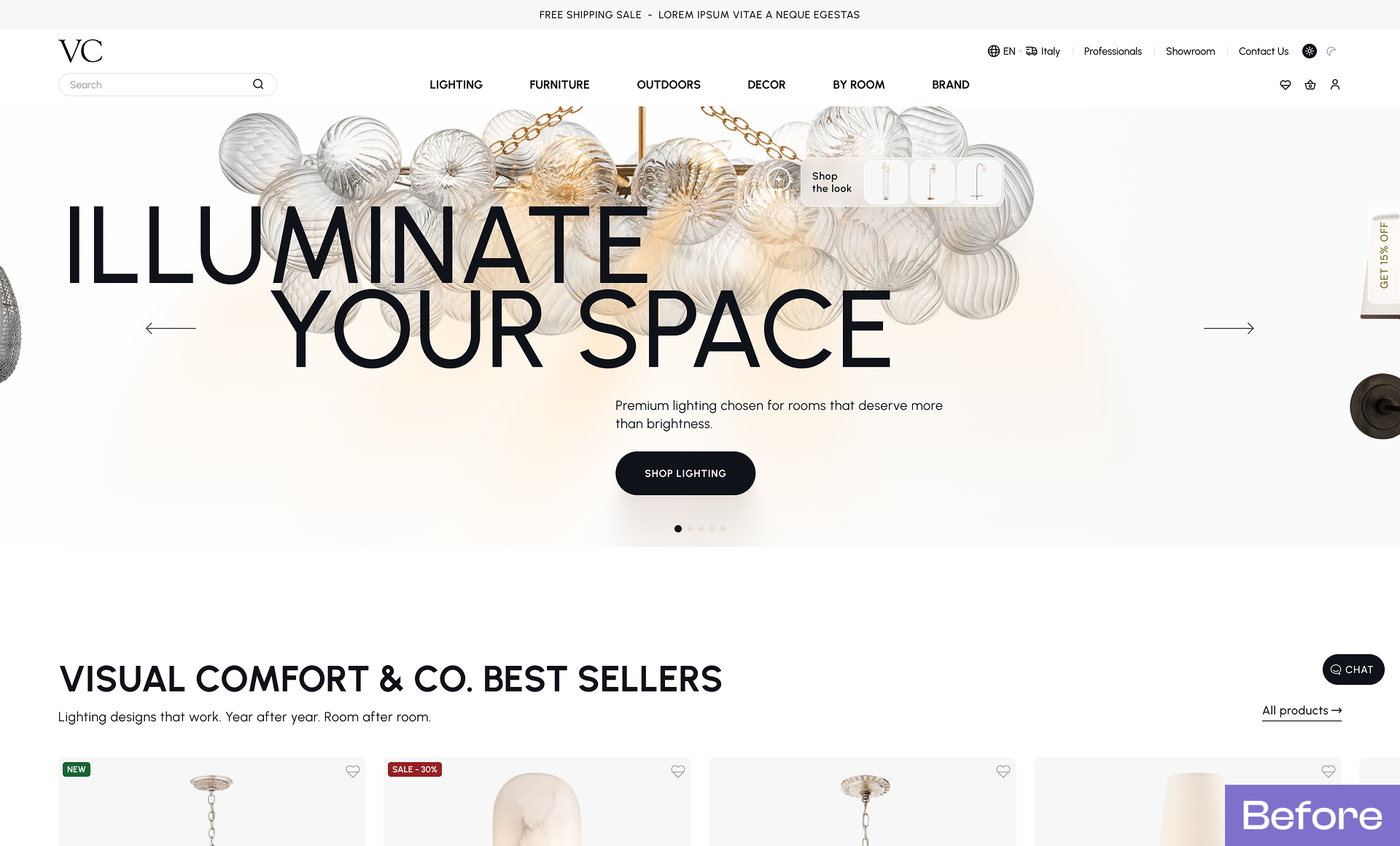
When VC Gallery came to us, they weren't looking for a new website. They already had a redesigned site that was built and ready to launch.
The problem was that critical parts of the experience weren't working properly on tablets and large desktop screens. With an important industry exhibition approaching, this became a serious issue: many visitors would be browsing the website on tablets during the event, and the experience simply wasn't ready.
The initial request was straightforward: redesign all responsive layouts and missing screens.
Considering the project's scope, this would have meant updating a significant number of frames across the website.
We could have taken that route.
Instead of redesigning everything from scratch, we analyzed the current website, identified the missing pieces, and focused on what would bring the biggest impact in the shortest time.
Our approach
Rather than rebuilding the entire experience, we:

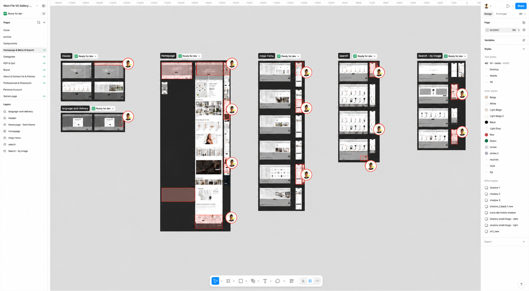
Conducted a full UX/UI audit of the existing website
Identified critical issues across desktop and responsive layouts
Designed missing interface components and screens
Created responsive versions for tablet devices and large widescreen displays
Reviewed all key pages and documented improvements directly in Figma for the development team
This approach allowed the client to save both time and budget while still significantly improving the overall product quality.
Key improvements
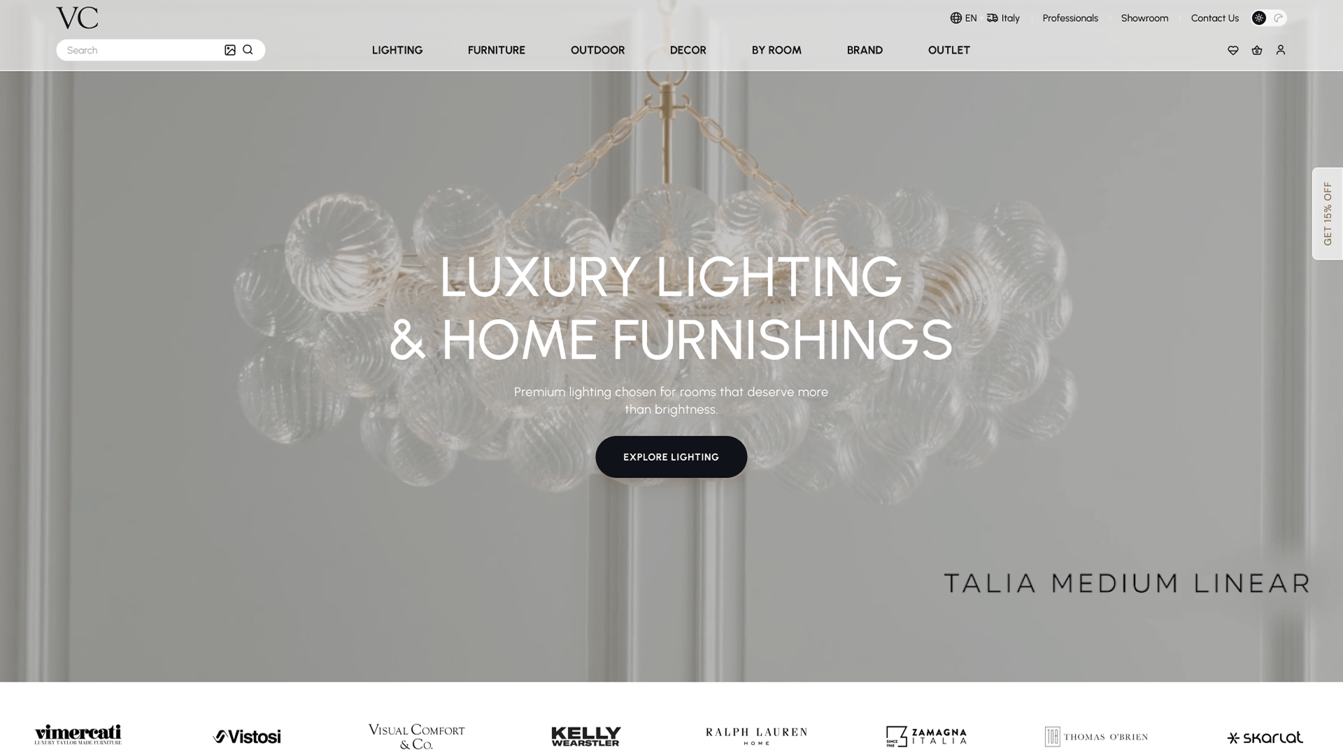
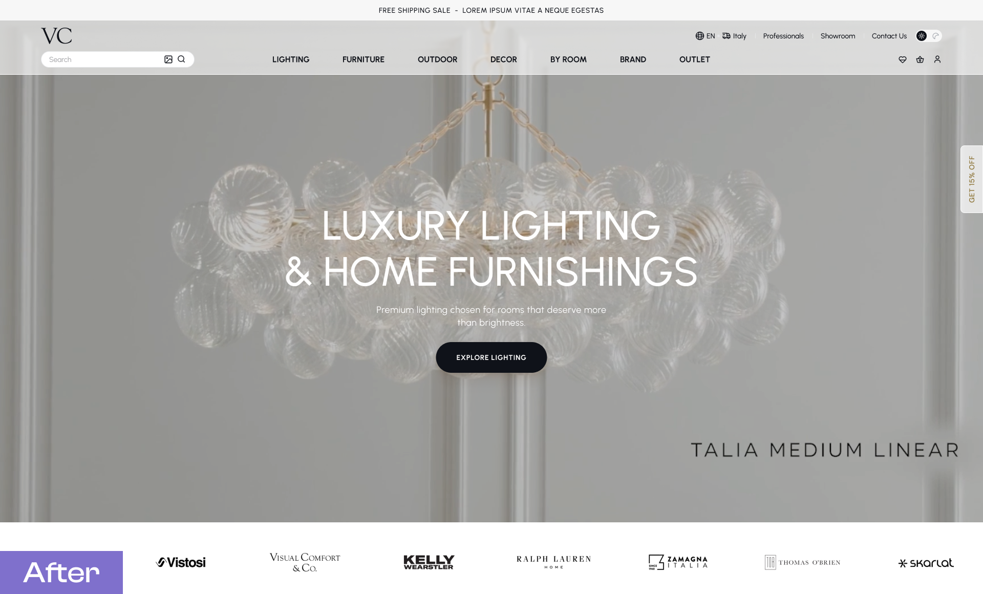
Homepage & Navigation
We refined the category section, refreshed the visual style of the cards, and improved the overall structure of the homepage.
The navigation system was reworked to provide a smoother experience across devices, and we designed a new region and language selection popup that was previously missing.
Internal Pages & UX Enhancements
Hero sections across the website were redesigned to create a more consistent visual language.
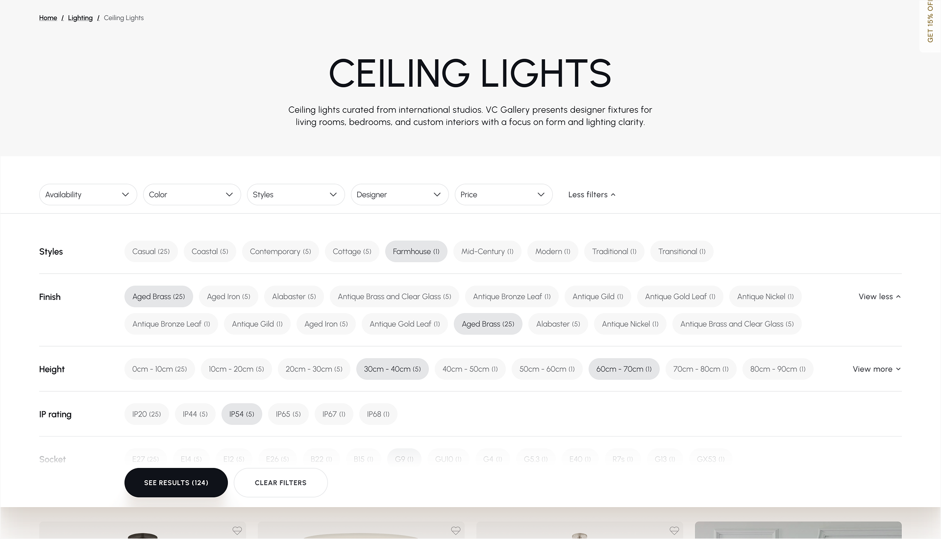
We also completely rethought the category filtering experience, making it cleaner, more intuitive, and easier to use while maintaining a minimal interface.
Brand & Designer Pages
The designer pages received targeted UX improvements and visual refinements to improve readability and usability.
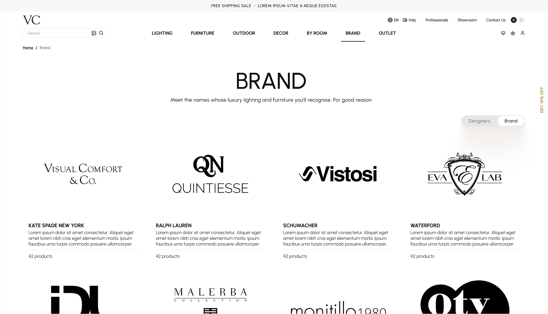
For brand pages, a deeper redesign was needed. Before the update, logos and cards lacked consistency, creating a cluttered visual experience. We introduced a clearer structure, balanced layouts, and a more cohesive presentation.
About Page Improvements
We refined logo presentation, spacing, alignment, and card layouts to create a cleaner and more professional appearance throughout the page.
Professional & Showroom Redesign
These sections received a complete visual refresh.
We introduced illustrations that guide users through the customer journey—from product selection and ordering to shipping and delivery—making the process easier to understand and more engaging.
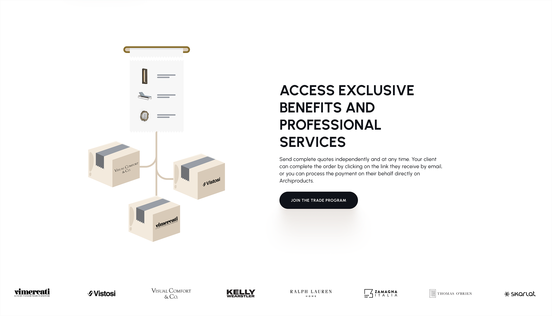
The card system was redesigned, visual hierarchy improved, and the overall interface became lighter and more modern.
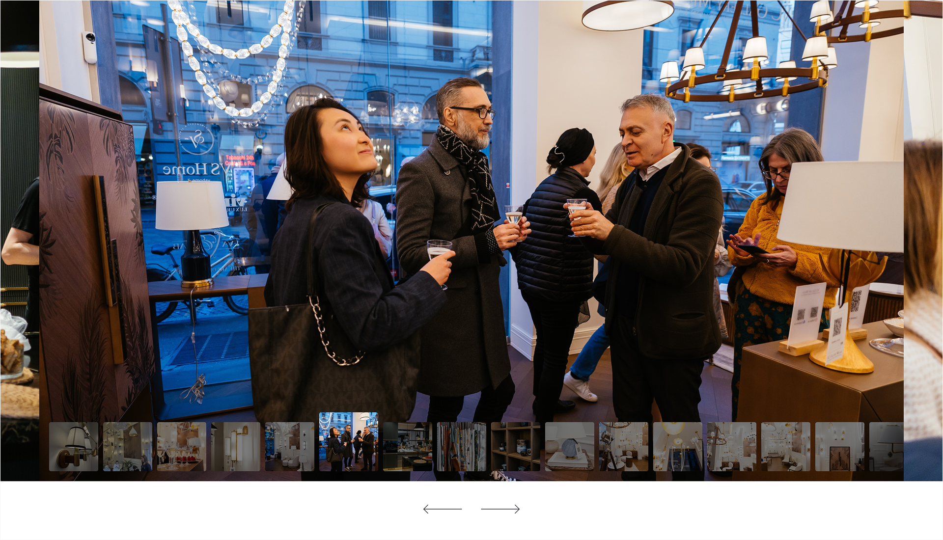
For the Showroom page, we added large atmospheric imagery that better communicates the space and its aesthetic, creating a stronger emotional connection with visitors
We also improved the contact form to make communication more seamless.
Partner Landing Pages
One of the largest parts of the project was designing 12 dedicated partner landing pages.
Each page was structured to clearly communicate:
Who the partner is
What makes them unique
Their products, projects, and collections
Materials, craftsmanship, and production techniques
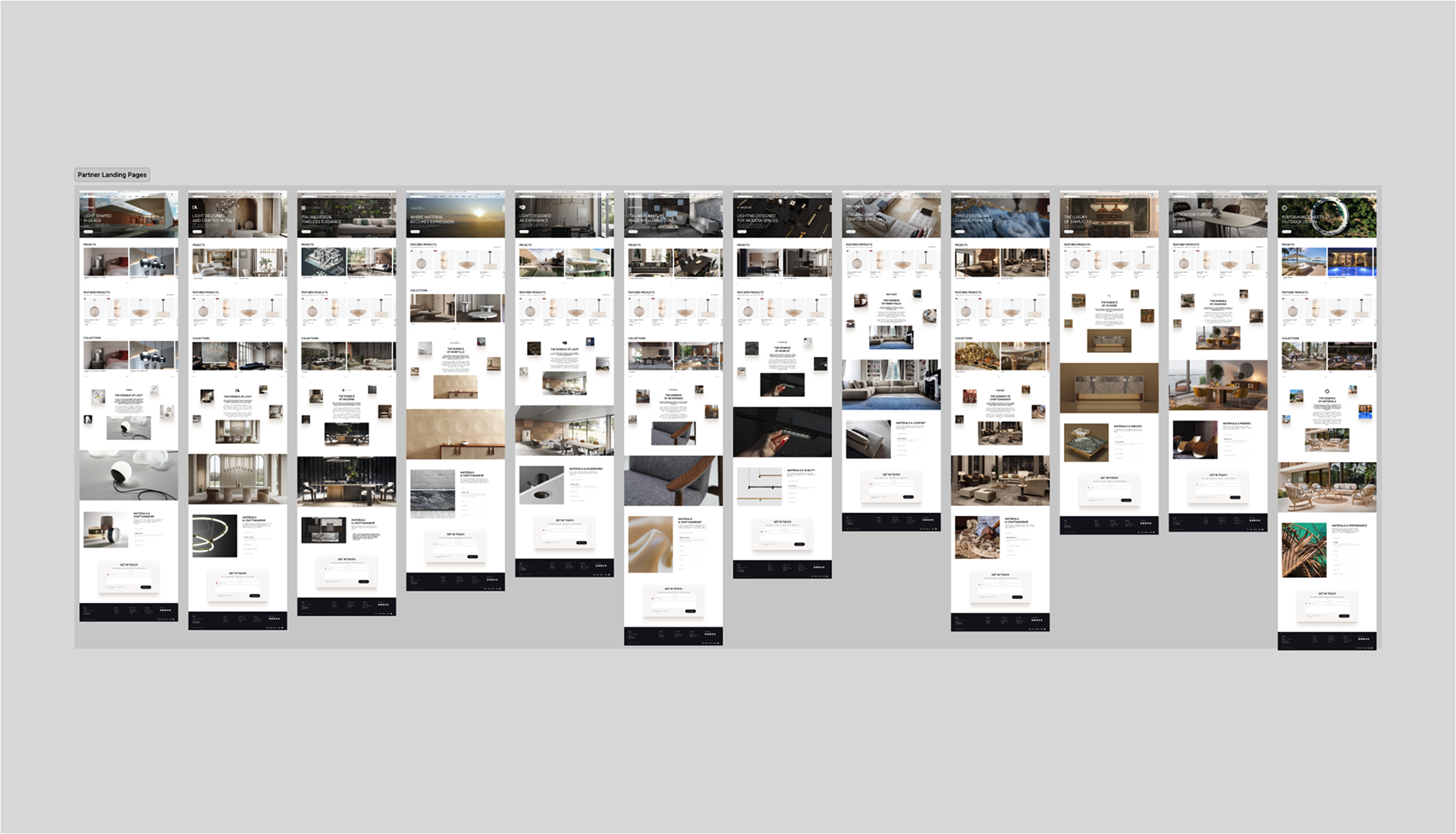
To enhance engagement, we incorporated subtle animations while maintaining a consistent visual language across all partner experiences.
The result
By focusing on fixing what mattered most instead of rebuilding everything, we helped VC Gallery move significantly faster.
Critical UX and responsive issues were resolved quickly
Missing interfaces were designed and documented for development
The website was successfully launched before the exhibition deadline
The team saved both time and budget
Most importantly, VC Gallery was able to use the updated website to attract new clients and support business growth
Sometimes the best design decision isn't a complete redesign—it's identifying the shortest path to a better product.